IKEA — the mystical land of flatpack furniture and Swedish meatballs.
There’s much to be said about this Swedish marvel of a business, starting from the fact that it remains the world’s largest furniture retailer and one of the most loved businesses worldwide.
So, what is it about the endless maze of open floor plans and decadent room displays that pulls us in? It can’t just be the pun-worthy names each item of furniture is endowed with or the neatly stacked rows of flatpack furniture just waiting to be unpacked and assembled. Akin to a Saturday morning sausage sizzle reward at Bunnings, there’s something about the experience of starting from the top and working your way through the maze of rooms, until you finally reach the haven of meatballs, soft-serve ice cream, and hot dogs.
What’s more: you get all of these things at a ridiculously low price. IKEA’s low costs for their furniture and food items is one of the key reasons why people suffer through the crowd to get there, time and time again. If that doesn’t appeal to customers, then their interesting choices of product names might.
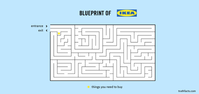
NTWRK co-founder and chief customer and people officer Garreth Dorey said: “Short of it being a maze, it’s also a-mazing at bringing to life the customer experience and journey mapping in real-time engagement.”
Customer journey mapping comes to life
“Customer journeys are the roadmap of a business. IKEA takes it to the next level. There’s more to their floorplans than carefully laid out aesthetics and room segmentation. IKEA’s floorplan is, in fact, a very carefully curated labyrinth that brings the customer journey to life,” said Dorey.
Each phase of room displays, paired with conveniently-placed feature items, creates touchpoints for the brand to engage with its customers beyond just securing a sale. This interactive and intuitive journey is by no means a covert operation — customers walk into IKEA knowing full well they’re being led through a sales pitch. And yet, they still go in, and they still buy things they didn’t know they needed.
It’s funny because it’s true. Right?
IKEA’s level of genius isn’t just about trapping their customers within a seemingly inescapable maze with only one exit. Granted, some people might feel like mice trapped in a maze, but IKEA’s floor plan is in fact, genius. The customer’s literal journey through the store allows them to experience the buying process at their own leisure. It allows for every product available, with the burden of purchase being only a casual but terribly convenient suggestion.
Holding their hands, but from a distance
Despite appearances, customers aren’t just left to fend for themselves. Dorey said: “IKEA’s engagement and interactions with their customers come from a distance and with subtlety. Their touchpoints range from large arrows painted on the floor and overhead signages to customer service and interactive IKEA information hubs.”
Subtlety is one of IKEA’s strong suits when it comes to crafting its physical and theoretical customer journey. Judging by the success of this global business and brand, balancing subtlety with obvious marketing goes a long way.
Maze with a meaning
“It’s all about perspective with IKEA. Customers walk in and experience immaculate interior design that could be their own. Beds to lie on, couches to rest their weary feet, neatly organised kitchens to strive towards. People walk into IKEA to experience the living space they dream of — and IKEA provides them with an opportunity to achieve these dreams. Each layout emphasises the idea of perspective and interactivity between customers and business,” said Dorey.
The ability to experience the products firsthand further boosts chances of purchases being made, or rather, increases the likelihood of conversion. Because the layout of the showrooms is a little tedious to manoeuvre more than once, customers are encouraged to make quick conversion decisions in regards to their purchases.
We’ve all done those drive-by purchases — packs of multi-coloured food clips, food containers, assorted kitchenware. Things that weren’t on our buying list but somehow made it into our reusable blue bags anyway. IKEA is a haven for impulse purchases, but that isn’t necessarily a bad thing.
IKEA gets away with these blatant marketing tactics for one simple reason — they add value. Customers venturing into their maze of display rooms and warehouses more often than not come away with a purchase they’re satisfied with. No matter the size of their purchases, they’re getting value out of their conversion one way or another.
The IKEA customer journey map isn’t all that hard to implement. It takes is some subtle customer engagement and a curated customer experience that’ll leave them coming back for more. After all, cheap, high-quality product is worth the adventure.
And if nothing else, there’s always Swedish meatballs!


