Not too many brands would be daring enough to lose their most iconic image for a new campaign, so it’s hats off to McDonald’s UK who decided to ditch its famed “golden arches” in a new outdoor offering.
The work of incumbent agency Leo Burnett and famed American designer David Schwen, the ad’s dispense with any imagery and logos and simply regale the ingredients of Macca’s’ menu items.

To the burger giant’s credit, the ingredients are simply so iconic that you immediately know what’s on offer by reading “bun, tartar, fish, cheese, bun”.
And for the real creatives out there, the spot’s use the Helvetica font instead of McDonald’s custom typeface, Speedee.
Commenting on the campaign, Leos UK creative director Pete Heyes said: “McDonald’s is a leader. Only a handful of global brands can communicate like this. The redacted and graphic nature of this latest campaign exudes the confidence McDonald’s and its iconic products deserve.”

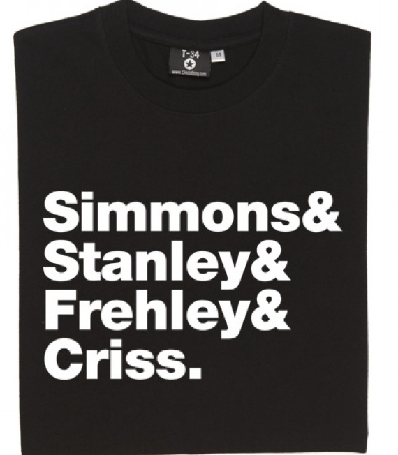
Apparently, the spots are based on a similar campaign Schwen did back in 2010. However, to B&T’s keen eye, they look remarkably similar to band T-shirts that are current in vogue at the moment that don’t name the band but just the members. Check out some examples below: