The term ‘A picture speaks 1,000 words’ has been traced back to a guy called Fred R. Barnard who, on 8 December 1921, wrote an article in the advertising trade journal ‘Printers’ Ink’, about the use of images in advertisements, writes Presentation Studio’s Emma Bannister.
In that edition, Bernard posted an ad entitled “One Look is Worth A Thousand Words.” Although his original message was to do with advertising, he came up with a fundamental idea that great presenters have been using ever since.
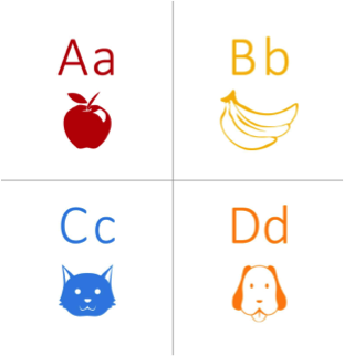
From a very young age, we are taught to associate words with images or things. Think about how young people learn to spell and learn the alphabet — they use educational alphabet boards, like the one we see here, to reinforce what they see with what they are hearing.
In a similar way, adults use this technique to increase productivity at work. Has your IT-manager ever tried to verbally explain to you and your team how to use a new software system, without allowing you to try it yourself? It is far more effective to be listening to your manager while you are actively engaged and learning about your new software — associating instructions or spoken word with a visual prompt.
Today, it is easy to become overloaded and lost in content. Many online, and for that matter print, publications are now using visual aids and prompts to attract more readers to their news. Social media platforms give detailed advice to businesses for how best to capture their audiences by combining visual stimulation with words. Just think about how many times you flick through your social media feeds or through the pages of a magazine or newspaper, only stopping when there is an image that catches your attention.
In the fight for people’s attention, presenters need to return to basics, and provide people with effective shortcuts to help them process what they’re presenting. Otherwise, it will be forgotten amongst the mass of information they’re already trying to store.
In his 2006 study into the ‘Conceptual and perceptual factors in the picture superiority effect’, Georg Stenberg dug into the effects of verbal versus visual communication. Running three experiments, he found a strong correlation between using visual stimulus and increased memory retention of his ‘test subjects’.
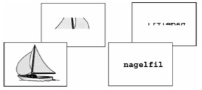
One of his experiments, cleverly named ‘Experiment 3’, asked students to look at images and words flashed up on a screen. Each slide would have the original ‘real’ image or word, and the second would be the same image or word, however with a large portion blocked out. He would then ask students whether the second image was facing the same way or whether it was reversed. Check out the image below to clarify and try it yourself.
He then recorded the response rate and found that 84 per cent of his students were able to correctly pick and recall the switch for the image slides, with only 66 per cent correctly picking it for the written words. Although this test didn’t ask students to recall information about ‘an image’ verses ‘written or verbal information about the same image’, it does highlight the human brain’s increased capacity to recall imagery over written language.
Sternberg’s theory is also supported by the fact that nearly 70 per cent of the receptors in the human body support vision, making it by far our dominant sense.
Other people like John Medina discuss the power of visual aids and their important role in great presentations. He claims that three days after hearing a piece of information, we will recall about 10 per cent of it, however if we add a visual stimulus, recall will reach about 65 per cent.
John goes on to reference another study where 3,600 everyday consumers were fitted with infrared eye tracking sets and asked to look at over 1,300 print advertisements. The study found that pictorial information was far more effective at capturing people’s attention, regardless of size.
How to put this to work
When it comes to the actual presentation however, many people will forgo the old saying and place too much emphasis on text — overloading their presentation and disengaging their audience. The aim of presenting is not to speak ‘to your presentation’, rather speak from it, to your audience. You’ll see impressive results if you have the confidence to verbally communicate with your audience, with visual prompts and limited text supporting you from behind.
Visual presentation tools like Prezi allow people to harness the power of images and graphics to create a non-linear presentation that is a more effective way of structuring a compelling narrative, while keeping the audience engaged. You can take your audience on a visual journey, keeping them focused on your content, and improving their overall comprehension and recall.
Planning is everything. So spend time thinking about the message you are trying to send and then attempt to look at it from the audience’s point of view. Ask yourself, ‘If I had not spent hours learning and practicing this, would I know what I was actually talking about?’ If not, alter your tack, and see if you could expresses some of your ideas visually. In saying this, don’t fall into ‘presentation norms’ by representing ideas like everyone else has. Company growth doesn’t need to be represented as a small seedling… in some dirt… in some random person’s hands… Does that really represent what you’re trying to convey?
Likewise, don’t fall into the trap of simply adding visual effects for the sake of them. Thought needs to be given to every element of the presentation to make sure each part is contributing in some way to the overall objective — and this includes the visual elements. With tools like Prezi that simplify visual communication, it can be easy to fall into a trap of overdoing it and using visual elements like motion and zooming for no apparent reason, other than it is fun.
Ultimately, there is truth behind the phrase, ‘A picture speaks 1,000 words’, and it has in fact been proven by science! When you are thinking about your next presentation, remember that images and graphics are some of the most powerful tools to use if you want to tell a story, evoke an emotion or even represent something beyond words.
Emma Bannister is an official accredited Prezi Expert and with her team at Presentation Studio, she has spent the last seven years helping individuals and corporations such as Qantas, Westfield, BHP and Telstra deliver visually pleasing and highly effective presentations that connect powerfully with audiences. Emma uses Prezi — a cloud-based presentation software — which unlike slides, has a zoomable canvas that shows the relationships between the big picture and fine details. She regularly tweets at @emmab_ps


