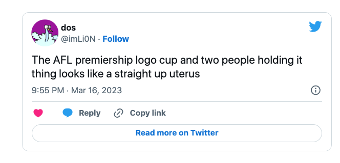
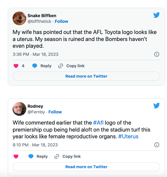
Toyota may be reconsidering its hefty $19 million a year AFL naming rights sponsorship (or, at the very least, its graphic design agency) after its new on-ground advertising was likened to a female uterus following the first round of games over the weekend.
The imagery (which you can view below) is supposed to show a silhouette of a male captain and coach lifting the AFL premiership trophy.
Is there a rough sketch of a uterus and fallopian tubes on the pitch? Very progressive of the afl 👏 pic.twitter.com/eW9OPlfZTI
— Gordi (@GordiMusic) March 16, 2023
However, when it aired during Seven’s live coverage over the weekend, some wags were quick to use social media to describe the illustration as having a distinct similarity to “a uterus and fallopian tubes!”
In a bit of a PR kerfuffle for the game’s administrators, most people who called out the imagery were female and suggested it wouldn’t have happened had more female eyes looked over the finished product.
Thankfully many people also saw the funny side. Check out some of the social media fallout below:
I really don’t think they showed a single female that Toyota trophy logo pic.twitter.com/IuIQt19ics
— Polly 💃🏼 (@PollyPorridge) March 17, 2023
Loving how inclusive the @AFL finally have become.
The current afl logo looks like a Uterus.#AFL#afltigersblues @aflwomens #aflrichmondVCarlton pic.twitter.com/nsdSUrfbsv
— Sally (@SupSki) March 16, 2023


