
In this Campaigns of the Month column, we take a close look at July’s standout ads from Amaysim, McDonald’s and Yfoundations.
Our good friends at System1 have put these campaigns through their testing model to see how they land with Aussie audiences. And to help us dig a little deeper, B&T has called on Today The Brave’s Kate Idle and Cyndall McInerney, Emotive’s Daren Wright, and Dentsu’s Carleen Ramsay to weigh in on the creative firepower.
From AI-generated telco spots to golden eras of chicken and gritty faux reality shows, this month proves that whether you’re selling phone plans or fighting youth homelessness, emotional impact is still the name of the game.
Amaysim, ‘Mega Data Deal, In-house
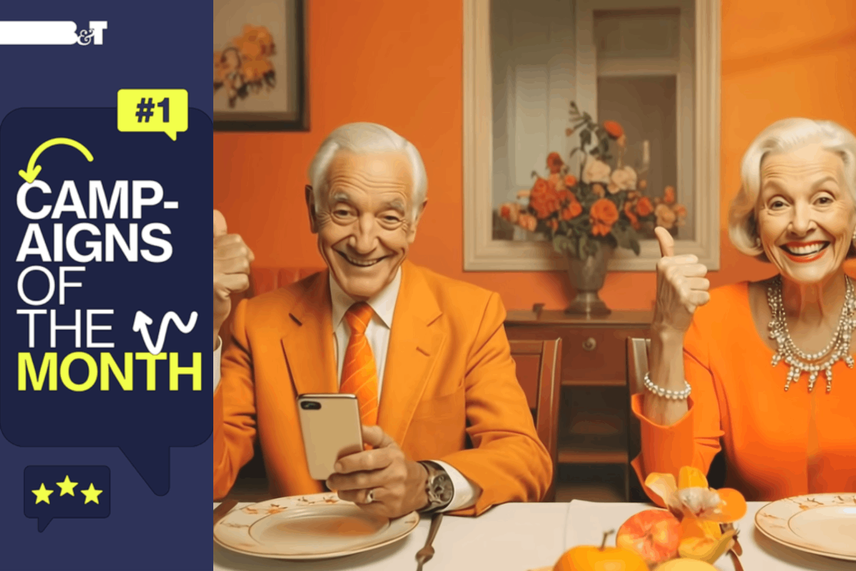
We’re kicking off with what has proven to be one of the most controversial ads of recent times: Amaysim’s AI-generated ad produced entirely in-house.
Is it a harbinger of doom for the advertising agency as we know it? Is it the canary in the creative coalmine? Perhaps.
But more importantly, what do actual, real-life consumers think? And do they give a shit?

System1 Report
Let’s face it: in some industries, creating emotionally engaging advertising isn’t just hard, it feels almost impossible. Unlike chocolate, travel or beer (all blessed with rich sensory triggers), categories like telco often fall flat. They’re seen as “dull.” But as The Extraordinary Cost of Dull report from System1’s Jon Evans, Peter Field and Adam Morgan at eatbigfish makes clear, the real commercial threat in these categories isn’t boredom. It’s neutrality. When audiences feel nothing, they do nothing.
Amaysim is challenging that status quo. Their latest campaign shows how brands in low-interest categories can cut through by prioritising emotional resonance. With catchy music, a sense of character and place, and strong use of distinctive brand assets (including that unmistakable orange), the ad stands out in a sea of sameness. While its Star Rating may not look blockbuster on the surface, it’s backed by a strong Spike Rating and emotional intensity, which is impressive for a brand still seen as a challenger in a category not known for tugging at heartstrings. System1’s recent Compound Creativity study found that consistency pays off emotionally, in brand recognition and commercially. So the advice for Amaysim? Stay the course. Keep leaning into that distinctive palette, stay bold with your tone, and double down on your distinctiveness over time.
Want to go one step further? Introduce a recurring brand character. As Orlando Wood details in Lemon and Look Out, characters are powerful memory structures that increase long-term effectiveness, boost emotion and make ads instantly recognisable. Bottom line: Telco doesn’t have to be dull. With the right creative approach, even the most “neutral” category can strike a chord and drive growth.

Creatives Weigh In
Kate Idle and Cyndall McInerney
“Chat GPT, please write a 100 word or less review for this ad. Be descriptive, from the perspective of someone who works in the advertising industry.” As fellow creatives, we appreciated the ad’s visual finesse—bold branding moments and clean transitions that give it a polished, cinematic feel. The narrative arc is crisp: a relatable problem, emotional pull, then a clear payoff. The voice‑over is confident yet human, and the pacing feels thoughtfully paced—never rushed, never lingering. Colour grading and soundtrack show strong production values. Fun fact—a tighter first 3 seconds would hook faster—skippable in‑stream ads demand it.
Daren Wright
Uh-oh the AI ad. Now this is a can of worms that my designated paragraph is not going to get anyway near solving! Is AI evil, no. Is it going to take our jobs, probably some. Will it open opportunities in the future, absolutely. But will it save an average idea, with an average script. Not this time. But I’m not sure a big old production would have helped either. Will it work, probably. It’s a pretty good deal!
Carleen Ramsay
This ad represents everything we fear as creatives: creativity, craft and nuance replaced almost entirely by AI. It makes for slightly uncomfortable viewing. Where Skinny Mobile cleverly wove AI into their idea, giving it purpose and drawing us in, Amaysim’s spot feels more like a proof of concept than a creative campaign. But it’s not trying to be Telstra, with its polished romantic take on staying connected. Amaysim is known for cheap and cheerful plans and by design this campaign reflects that perfectly. Created in under two weeks, it’s a remarkable showcase of what tools like Adobe Firefly and Runway can deliver in a pinch. Is it a creative triumph? No. Will the average viewer care? Probably not. Will it stand out with its strangely optimistic orangeness? Absolutely.
McDonald’s, ‘The New McWings’, Wieden & Kennedy
Wieden+Kennedy arrived in the Australian creative market to much fanfare (and some derision after PR-ing its all-male creative leadership).
This isn’t the agency’s first work for Macca’s but it is probably the most important the agency has produced thus far. It’s priming Aussies for Macca’s entry to a new product category—crispy, juicy, tender fried chicken. Or not, as one B&T hack will attest.
System1 Report

Next up for Ad of the Month is a brand that needs no introduction: McDonald’s. Promoting their new McWing product, the ad focuses squarely on driving foot traffic and sparking curiosity about the new menu item, and it does both effectively.
With strong short-term activation potential and high brand fluency, McDonald’s is well positioned to see an immediate uplift. That familiar branding means the next time Aussies are craving wings, it might just be Macca’s they think of, rather than the usual suspects in the category.
This is a classic performance-driven campaign, heavy on product visuals, functional messaging and voiceover-led delivery. It’s not one for the brand-building trophy shelf, but in this context, that’s beside the point. McDonald’s knows how to show up for both brand and performance. It’s this dual focus that has helped them become the powerhouse they are today.

Creatives Weigh In
Kate Idle and Cyndall McInerney
Nice to see that even with a new agency, Macca’s is steadfast in their commitment to “light humour and a Brandon Burke VO”. This is a product brief with a big name client done nicely. Sure, the ad doesn’t break any conventions, but that’s not what it’s designed to do. For a functional, product-led ad, it’s got a bit of a smile. Not sure the dude in the teal shirt has ever touched a power tool in his life, but that’s probably because he’s also packed a fern for the same ambiguous tradie job. Forgettable, but polished. We look forward to seeing it while we scroll TikTok and eat at Wings and Tins.
Daren Wright: Emotive
I suspect showing people eating chicken wings was an absolute mandate in the brief, so in 15 seconds there’s not a lot of wiggle room. But in the wiggle room they did have they’ve managed to land a nice little idea of peak chicken is upon us. Got some tight witty “says more about historians’’ dialogue. But it’s the casting of the VO and him singing the sonic pneumonic that tickled my taste buds. Delicious
Carleen Ramsay, Creative Senior Art Director: Dentsu
You had me at golden era of chicken. And chicken isn’t even my thing. But what a compelling promise. No, Macca’s isn’t the first place you think of when you think of perfectly crunchy well-cooked chicken. But Macca’s is planting the flag and promising prime chicken to the masses. And for households that can’t decide between burgers or chicken, now there’s no need to choose. Feels kind of historic, right? Executionally, the films are solid but safe. However, the sting at the end is a delight. The coded billboards are fun. I particularly appreciate that they went as far as incorporating my favourite font ever, Wingdings. Honestly, genius move.
YFoundations, ‘Young & Alone’, Ogilvy, PHD & UnLtd
System1 Report

We’ve already talked about how brands can break free from “dull” category tropes. Now we turn to a more specific challenge in a more emotionally loaded space: the sea of sadness that often defines Charity and Non-Profit advertising.
System1 has explored this category extensively, with one recurring insight: while emotion is essential, many charities lean too heavily into sadness, fear or guilt to trigger high emotional responses. A recent example is Yfoundations, which scored an emotional intensity of 2.10, more than double the Australian average.
While this high emotional intensity can drive short-term donations, clicks and attention, it comes with a risk. Behavioural science identifies this as the Ostrich Effect. When audiences are overwhelmed by sadness or guilt, they are more likely to look away or disengage rather than take action. In other words, the ad might hit hard, but not always in a way that encourages lasting support.
So what can charity brands do?
Our advice is simple: end on hope. Sadness can create urgency and highlight the seriousness of an issue, but it should be resolved quickly and replaced by a sense of optimism by the close of the ad. This peak-end strategy helps ensure the lasting impression is one of possibility and impact, not helplessness.
Show audiences how their support leads to meaningful, positive change. This encourages future donations, not just one-off reactions. Yfoundations’ ad is a strong emotional piece and will likely deliver a short-term spike. But for long-term brand growth, too much sadness can undermine the loyalty and positivity needed to sustain ongoing support.

Creatives Weigh In
Kate Idle and Cyndall McInerney: Today The Brave
The concept behind these is super cool. Highlighting the fact that we’re all so eager to switch on to the latest live-rough-for-entertainment survival show, but turn a blind eye to those most at risk on our doorstep, is a tough pill to swallow, but a powerful message. There’s really nice attention to detail in the cinematography and edit that amps up the ‘reality show’ POV style to create a more realistic, emotional perspective into their struggles. Some elements started to teeter the line between respectful and impactful which lessens the impact and that gut-punch reveal at the end, but it’s a really important message delivered in a way people are prepared to engage with, so huge props to the Yfoundation and Ogilvy.
Daren Wright: Emotive
43,000 young children and young people facing the effects of homelessness is an incredibly harrowing and worrying statistic. This campaign does a great job of bringing this issue to light. The film itself is incredibly emotionally charged and plays on the right side of showing you the stress, trauma and heartbreak of these kids without going so hard into this world that you want to look away. The ‘faux’ TV show I don’t think has been designed to trick the audience into actually thinking it’s a TV show. But it does give them a great creative vehicle to execute across multiple channels and the line on the 30 second ‘The reality that nobody’s watching’ I really liked (not sure why it’s not on the 60”?). I really hope this works.
Carleen Ramsay, Creative Senior Art Director: Dentsu
Like many, I’m guilty of indulging in the odd evening of wall-to-wall reality TV. This campaign cleverly taps into our insatiable appetites for the voyeuristic. It has all the makings of what promises to be great Wednesday night viewing. Which is kind of the point. From the comfort of our cosy homes, it’s easy to watch mindlessly and just as easy to detach. This campaign turns the ‘survival as entertainment’ genre on its head to shine a spotlight on the hidden issue of youth homelessness. If it were a documentary, you can bet I’d watch it.


