In this guest post, marketing scientists from Adelaide’s famed Ehrenberg-Bass Institute, James Martin and Adam Gelzinis, review Formula One’s new logo and look at the lessons for brands considering a similar re-brand…
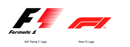
At the final race of the 2017 season, Formula 1 revealed their new logo, which will represent the brand from the start of the 2018 season.
F1 commercial chief Sean Bratches stated that a key motivation for this change was to simplify the design for today’s digital era – a move also recently made by Coca-Cola and Starbucks. The new mark is designed to be more flexible and versatile on mobile and digital platforms, compared with the old logo, and is a key step in a wider initiative by F1 to reposition the racing organisation as a media and entertainment brand.
Visually, the new logo is bolder and simpler than its predecessor, with the iconic ‘flying 1’ replaced by three bold lines denoting F1. The new design also does away with the use of negative space to form the “1” between the “F” and the red swoosh.
Love or hate the new logo, Formula 1’s justification for refreshing the brand is reasonable. But, in their haste to modernise the brand, has Formula 1 neglected the formula for effective re-branding? What are the implications of this change?
Branding elements like logos, slogans, colours and characters are assets that brands build over time to become more noticeable and memorable. Consumers (or racing fans) then use these assets as a shortcut to identify a brand. To have a logo embedded in people’s heads and be instantly recognisable is extraordinarily valuable, and it can take years for a brand to build. A dramatic change to a long-standing logo, such this example by Formula 1, can write off this long-term investment in an instant. As with changing any of a brand’s distinctive assets, marketers must consider the risk of diluting people’s associations with the brand.
For a logo to be useful, it must be unique (to avoid confusion with other brands), famous (known by a large number of people), and evocative (linking the logo to the Formula 1 name). By replacing their logo with something so different, F1 is going back to the starting grid and must begin building brand linkage all over again. It also risks being confused with other brands, for example ESPN’s similar bold red design.
When modernising a logo, it does not need to be radically different to its predecessor. A new logo can still be reasonably linked to the original one, which will stretch the developed brand linkage, but not break it. A recent example is Subway, who updated their logo from the early 2000’s last year. The new logo uses a slightly different yellow and green colour palette, but overall has a similar design. Notably, the brand keeps the distinct arrows on the S and Y. Another example is Google, who updated the typeface used in their logo but left the colours nearly identical.
Being modern at the expense of a brand’s history can be like taking one step forward but five steps back. Granted, the new F1 logo is simpler and may be easier to distribute digitally, but at what cost?
James Martin & Adam Gelzinis are Marketing Scientists at the Ehrenberg-Bass Institute. For more on Distinctive Assets and how to build them, look out for the Ehrenberg-Bass Institute’s new book ‘Building Distinctive Brand Assets’ by Professor Jenni Romaniuk which will be available in March 2018.


