
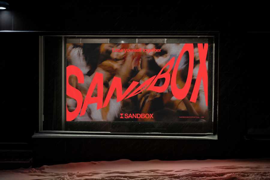
Sandbox has launched a new brand identity via independent creative agency Born, to evolve from an established club night into a brand to grow as a multi-city, multi-day festival.
Having built a reputation for immersive experiences and a devoted following, Sandbox needed a brand that could move beyond familiar club visuals and carry greater clarity, distinctiveness and emotional depth. Born’s response was an identity built around a simple idea: Time lost together.

At the heart of the new brand is a sandtimer mark, formed from two inverted triangles, symbolising time in endless motion. That mark became the organising device for the wider system, informing everything from a dithering treatment that turns imagery into grains of sand, to fluid motion behaviours and a visual language that feels constantly in transition.
The new identity focuses on the deeper psychological experience at the centre of Sandbox: the collective release that happens when music, movement and environment collapse into one shared state.

The result is a brand world designed to feel immersive, transportive and alive across screens, environments and festival touchpoints.
“Sandbox was never just about a night out. It was about a rare kind of collective escape. We wanted to create an identity that could scale with the brand’s ambitions, while still holding onto the emotional truth at its centre: that moment when the music, the crowd and the room become one, and time stops making sense,” said Born strategy director Jordaine Chattaway.

“As Sandbox grows, we needed an identity that could match the scale of where we’re going without losing what has always made it special. Born understood that immediately, and created a system that feels both considered and completely immersed in the spirit of the experience,” said Sandbox Group director Andrea Calogero.
The Sandbox work spans strategy, branding, graphic design and campaign.


