



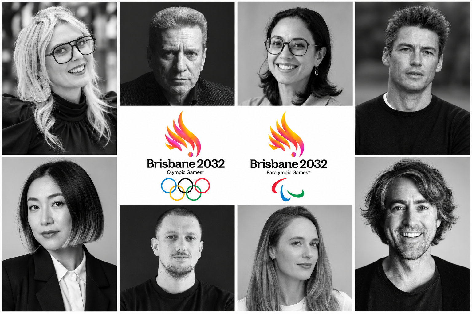
Olympic and Paralympic emblems come to define a city and over the weekend, somewhat accidentally, Brisbane unveiled its 2032 edition to the public, but does the design and advertising community think?
The Brisbane 2032 logos, created by local and global agencies, including VML, Landor, Black Card, and Verian, take the shape of two iconic Aussie birds in the pink and sulphur crested cockatoos with the Olympic rings and Agitos Paralympic Games symbols.
The outline of the birds represent the shape of Queensland, which will be hosting events up and down the state. And it is also the shape of an Olympic torch.
Meanwhile, the use of two and three feathers is a nod to ‘2032’.

At the recent Cairns Crocodiles event, Brisbane 2032 chief marketing officer Brent Hill recently hinted that bin chickens may play some role in Brisbane’s Olympic identity—something which many Australians would have found amusing, no doubt—but it appears that the cheeky and more attractive cockatoos have beaten the ibis to the punch when it comes to the most important visual symbol.
Designing Olympic and Paralympic emblems is no easy feat. The International Olympic Committee has very strict guardrails and requirements, while the logos need to be versatile enough to feature on every from table tennis balls to massive in-stadia signage.
The emblems have received broadly positive public feedback, and B&T’s newsroom are among the fans, but what do the experts think?
Has Brisbane 2032 hit the right mark with such an iconic emblem? B&T approached advertising and design experts to find out.
Dr Kenneth Cato AO, chairman and global creative director, Cato
I believe it’s most unfair to comment on the work of others when you have not been party to the brief. Industry reaction normally results in criticism.
From previous Olympic experience, I appreciate the difficulties of finding a meaningful symbolic component appropriate to the city and sympathetic to the games.
The symbol however, reminds me of the overused Indonesian Garuda plumage symbols or the New Guinea bird of Paradise. I’m unsure of the connection to Brisbane.
I think it’s a pity that the year 2032 dominates the host city name. It’s simply not as important as the word Brisbane. The subtle colour differences and gradations make it a nightmare to use, and I can’t imagine defining the differences of both marks when used in a single colour. Just me being practical.
I hope that it will work across a multitude of uses.
Jo Cao, design director, Howatson+Company
Brisbane 2032 is both clever and joyful. The mark resolves its double read beautifully: torch flame and cockatoo in a single gesture, with one magenta dot doing an enormous amount of heavy lifting. It’s unmistakably Australian without a bit of kitsch, and the palette is pure Brisbane: jacaranda, azalea and the sun. Reversing the gradient for the Paralympics is a lovely, considered touch.
The wordmark is very charming. Title case, tight tracking, a generous x-height and playful flicked terminals give it warmth and real personality. Thank goodness it’s not another uppercase geometric sans lockup.
Inevitably it invites comparison with Sydney 2000, a mark that had its charm but now reads firmly Y2K. Both are memorable, and
Brisbane more than holds its own in the Olympic line-up. Brisbanites, take a bow.
Nicholas Adamovich, head of design, Havas Host
Half the battle is getting anything out the door these days, so hats off to everyone involved – particularly on a project with the scale, scrutiny and number of stakeholders that come with the Olympics.
There’s enormous pressure on an Olympic identity. It sits within a design legacy that includes Tokyo ’64, Mexico ’68 and Munich ’72 – identities that have become part of design history, so the scrutiny is inevitable.
At first glance, this feels optimistic and appropriate for Brisbane. The challenge now is whether it can build the distinctiveness, flexibility and cultural resonance needed to become truly memorable and stand the test of time.
Ultimately, the logo is only one part of the equation. The bigger question is whether the wider system can create something unmistakably Brisbane – and strong enough to hold together across every touchpoint of the Games.
Brisbane 2032 emblem explainer video
Ruby Grose, design director, Bulletproof
It’s a really strong piece of design. The way the cockatoo, flame and broader Queensland symbolism have been brought together in a single mark is genuinely clever, and it gives the identity a memorable sense of place.
My only question is whether it’s trying to communicate one too many ideas, where a slightly more stripped-back, iconic approach might have been punchier.
That said, I’d much rather see a brandmark with depth and personality than something safe or generic. Overall, it’s a strong identity and one that I think Aussies can be proud of.
Reece Ryan, executive CX tinker, Thinkerbell
I like it a lot.
Progressive. Sharp. Confident. A literal crest anchored in Aussie-ness.
Our wildlife and epic sunsets are something to behold, so there’s a lot of equity packed into something with the potential to become truly distinctive.
Like every great brand icon, it’s reductive in shape and colour but it’s layered with meaning.
And love them or loathe them, the squawking of cockatoos is the background soundscape to so many Brissy memories. There’s something really nice about seeing that familiar bit of Brisbane life elevated into an icon for the world stage.
Olivia Gordon, graphic designer, The Misfits Media
I love the idea of a flaming cockatoo being at the heart of the new Brisbane 2032 Olympic and Paralympic emblem.
The flaming cockatoo is honestly such a befitting choice combined with the Olympic flame and the outline of the Sunshine State, it perfectly captures the spirit of both the Games and Brissy. I feel the excitement and competitiveness of the Olympics, but also choice of colours brings to myself a deep sense of connection to Australia in general.
I love to see the versatility of the emblem. Seeing Olympians holding the separate feathers feels incredibly powerful, almost heroic in its symbolism. The font though, was a little unexpected. Not the biggest fan of it by itself however, I think this it does compliments the emblem and brings the extra flaire.”
James Orr, creative director, SICKDOGWOLFMAN
I don’t hate it. But I don’t love it either. My reaction was a pretty mild, ‘Yeah, OK’. And maybe that’s the problem.
Does an Olympic logo need to be divisive? Does it need to push boundaries, spark debate and make people choose a side? Or does it simply need to do its job? In comparison to the great Olympic identities of the past, Brisbane feels safe. Competent. Considered. Designed to please rather than provoke.
But the realist in me also understands the brief. This isn’t a normal logo project. It has governments, committees, organisations, stakeholders and countless hands raised wanting their two cents. That’s hardly an environment that rewards iconic design. So maybe this is exactly what that process produces.
The punter in me says, ‘Yeah, OK’, and moves on. The design nerd in me wishes they’d given us something harder to move on from.
Rachel Terkelsen, creative director, Principals
Brisbane 2032’s emblem is built on a genuinely clever concept. A pink cockatoo that doubles as an Olympic flame, with a nod to Queensland’s silhouette. It’s a celebratory piece of Australiana that sidesteps the cultural cringe of another kangaroo. Or Nemo.
But a Games emblem needs to capture the spirit of its host city and, with six years to go, the city it’s becoming. Brisbane is already contemporary, confident and edgy. Yet the emblem’s traditional forms and stock-style gradients feel more turn-of-the-millennium than Brisbane 2032. And the symbol sits uneasily with its relaxed wordmark.
The Paralympic emblem’s switch to a yellow sulphur-crested cockatoo is barely noticeable, and probably unnecessary. Since Paris 2024, one emblem for both Games has rightly become a statement of equality.
Of course, the emblem is just the opening play. The “Look of the Games” still has time to knock it out of the Gabba and crown Brisbane the Queen of Cool.


