Heineken Gets Shirty At New Google Logo’s Distinct Similarities


Yesterday Google revealed its latest hairdo to the world, The new logo and branding has caused a ruckus online with people calling out the tech giant for copying Heineken’s Logo.
As reported in B&T, the new look and feel was the brand’s attempt to make interacting with Google on its various platforms a seamless experience. However Twitter users pointed out Google’s new crooked “e” rips off Heineken’s logo.
Google’s new logo
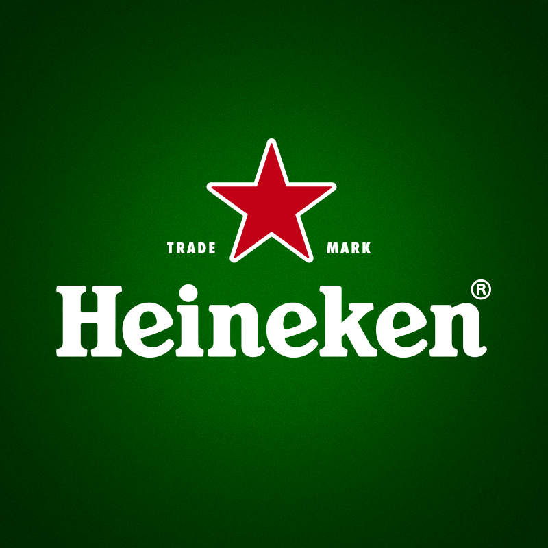
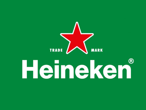
Heineken’s logo
Google Netherland’s Twitter account admitted the similarities, tweeting out “Inspired by the most @heineken_NL”:
Geïnspireerd door de meester. /cc: @heineken_NL pic.twitter.com/RhBMko6Qrl
— Google Nederland (@GoogleNL) September 1, 2015
Heineken replied:
Hi @Google, you’ve inspired us too… #Googlelogo#SmilingEpic.twitter.com/RIuysTkdsk
— Heineken NL (@Heineken_NL) September 1, 2015
In other Google news, Sydney-based creative agency AnalogFolk have ‘Googlefied’ 10 famous logos in honour of Google’s rebrand:


Logos created by Michael Kleinman (https://twitter.com/metamike) and Josef Wimberger (https://twitter.com/josefwimberger)
Latest News
Sydney Comedy Festival: Taking The City & Social Media By Storm
Sydney Comedy Festival 2024 is live and ready to rumble, showing the best of international and homegrown talent at a host of venues around town. As usual, it’s hot on the heels of its big sister, the giant that is the Melbourne International Comedy Festival, picking up some acts as they continue on their own […]
Global Marketers Descend For AANA’s RESET For Growth
The Australian Association of National Advertisers (AANA) has announced the final epic lineup of local and global marketing powerhouses for RESET for Growth 2024. Lead image: Josh Faulks, chief executive officer, AANA Back in 2000, a woman with no business experience opened her first juice bar in Adelaide. The idea was brilliantly simple: make healthy […]
Is Meta’s New AI Chatbot Too Left-Wing?
Meta's chatbot accused of being left-wing after being caught wearing a Che Guevara T-shirt & listening to Billy Bragg.
TV Ratings (23/04/2024): Why Did No One Tell Angela That Farmer Wants A Wife Is Set On A Farm?
As wonderful as this headline is, let's face it, we all know an 'Angela', don't we?
PubMatic Unveils New AI Partnership To Turn Social Posts Into Ads For Any Digital Channel
Here's some nifty tech for turning social posts into ads. Assuming said posts aren't one-star character assassinations.
Intuit Mailchimp Makes A Splash With Its First Australian Brand Campaign
Ever laugh along at a gag you didn't get so as not to appear dumb? Get ready for more feigning with this new work.
GumGum’s Rob Hall: Advertisers Can No Longer “Rely On Binary Descriptions” Of Consumers
If anyone's got their finger on adtech's pulse, it's Rob Hall. He also avoids using the good paper in the office printer
Mastercard Nabs Florencia Aimo From Marriott International
Marriott International's Florencia Aimo jumps from the hotel business to the exploitative credit card one.
Bastion Agency Appoints Cheuk Chiang As New ANZ CEO
Cheuk Chiang takes the reins over at Bastion Agency. But not the rains down in Africa.
Spotlight On Sponsors: Major Sponsorship Wins After A Disappointing Week In Sport
B&T continuing our deep dive into local sport sponsorships & that's despite not a single offer of a free ticket as yet.
Macca’s Marketing Director, Samantha McLeod On Big Mac Chant: “What Was Once Old Is Now Cool Again”
Macca's using the power of nostalgia in latest Big Mac campaign. Well, only for those who've ever eaten one sober.
World Premiere Of Midnight Oil: The Hardest Line To Open Sydney Film Festival 2024
Oil's biopic to open Sydney Film Festival. Here's hoping Molly Meldrum will take his pants down at the premiere.
Entries Are Now Open For The 2024 Brandies, IntelligenceBank’s Annual Brand Marketing Awards
The Brandies are, of course, a prestigious marketing gong and not the mystery tipple favoured by nannas everywhere.
The Fred Hollows Foundation Appoints Ardent For PR
Yes, we all like to have a joke at PR's expense. But sometimes it does important work, like this.
AI, eCommerce & Marketing Specialists Are In Increased Demand By Businesses, New Data From Fiverr Shows
Has your philosophy & anthropology degree left you with nothing but a huge HECS debt? Here's what you should've studied.
Perth’s First 3D Anamorphic Billboard Arrives Courtesy Of oOh!media
Do you love a buzzword? Now you can add anamorphic to the list as it relates to billboards, not a colleague's ears.
MasterChef Australia & Crown Resorts Launch Unique Dining Experience With ALUMNI
A pop-up restaurant staffed by MasterChef contestants! That's fine dining prices for first-year apprentice chef cuisine!
Amanda Laing Announces Resignation From Foxtel Group
Foxtel's chief commercial & content officer heads for the exits. Read nice things the bosses said about her right here.
The Lost Letters From Our Diggers: News Corp Unveils ANZAC Day Special
It's nice when brands respectfully acknowledge ANZAC Day.
Howatson+Company Acquires Akkomplice
Large indie acquires a slightly smaller indie. Much like a shark eating a tuna, just with less thrashing and blood.
Google Delays Third-Party Cookie Deprecation Again
In good news for the sale of picture library biscuit photos, Google continues to tease over the end of cookies.
Education A Low Priority For Aussies More Concerned With Cost Of Living Forethought Study Reveals
Study finds Aussies cutting back on education due to cost of living. Booze & Uber Eats sales remain largely unaffected.
“I’m Still The Same Person That I Was”: Rikki Stern Says “Fucc It” To Cancer Stereotypes
B&T always happy to promote the anti-cancer cause. Even brands that massively overdo it with the hot pink.
The Unapproved Climate Certification Allegedly Causing Mass Greenwashing
Are you left flummoxed in the canned tuna & free range eggs aisle? Just wait till this green certification gets up.
TV Ratings (22/04/2024): Fans Mock “Over The Top” Reaction To New MasterChef Judges
MasterChef returns for its 2024 season. B&T stands by putting peppercorns in Gravox & no one will be any the wiser.
Dentsu Restructure: Muddle, Harvey & Johnston Take Leadership Baton As Bass & Yurisich Exit
A large broom has swept through Dentsu's local ops this morning, taking with it some big names & the air con's cobwebs.
Industry Shares Trends Shaping The Industry This International Creators Day
B&T's asking adland creators to reveal their top trends. And it's not good news for your Jenny Kee cardigan collection.
Mable Extends HOYTS Sensory Screenings Partnership
Mable has extended its HOYTS sensory screening partnership. Vigorously defends its two-star Oppenheimer review.
Orphan Launches ‘They Need Our Help. We Need Yours’ For Children’s Cancer Institute
Anything to do with childhood cancers has B&T's 110% support. That said, we do ignore the red meat & alcohol warnings.
Smile Team Orthodontics & Keep Left Collaborate On Smile-Inducing Campaign
As parents would attest, given the cost of orthodontics you'd expect this campaign to be a lavish production indeed.
Opinion: How Video Calls Neglect Learning Diversity
Need an excuse to duck out of a video call this arvo? Show this to your boss.
DoubleVerify Achieves First-Of-Its-Kind Responsible AI Certification From TrustArc
DoubleVerify receives responsible AI certification. However, not its robotic vacuum that's been seen menacing the cat.
Smile For A Good Cause: The Social Media Campaign Giving Back To The Community
Are you known as the office Austin Powers? More for you teeth than shagability? Get snappy new fangs with this news.
Elon Musk Mocks Albo After ESafety Wins Court Injunction Against X
Albo's 2024 from hell continues - Rabbitohs in crisis, down in the polls and now feuding with world's richest man.
Real Estate Developer In Hot Water Over “Sexually Exploitative” OOH Campaign
Real estate agents again tops in the 'least trusted profession' polls, nudging used car salesmen & ad creatives.
Epsilon’s Shane Hanby: Post-Cookie Era Relies On “Teamwork” Between Brands, Marketers & Tech
This pro predicts more "teamwork" in a post-cookie era. Which spells bad news for the uncooperative or plain stubborn.